19th Century
bookrags.com/typography/wiki
bookrags.com/typography/wiki
www.nicksherman.com/.../woodTypePoster.gif

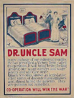
early 20th century
www.the-forum.com/Posters/images/wwi135.jpg

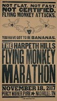
recent work, hatchshow
i68.photobucket.com/albums/i27/rosenbst/hatch.jpg
 recent work, yeehaw ind.
The first two images exhibit traditional stacked type, as seen on many early posters. Not too effective to show visual importance, especially in the 2nd poster. The first one features illustrations and shows the common icons, ex: the pointing hand. The 3rd image is not fresh from the 19th century, but a new look since my peers may be pulling from so many of the same online from the 19th. This is an early American propaganda poster. More illustrative, shows improvements with incorporation of image with text and subject matter, as opposed to previous popular poster styles.
The fourth image, a classic look and feel print from HatchShow, mixes bold sans serif with a line of serif. The fonts flow more peacefully than the style of images 1 and 2. This is a sort of reinvented, prettier, classic look.
The fifth image, highly informational, information stacked similar to an old sort of style. San serif is only style used, unlike the commonly used serif in the past.
The fifth image, a digital take on the extreme traditional stacking and wide font variety style.

 recent, digital
No comments:
Post a Comment