iWhat intrigues me about Zwart is his use of the bold. The colors, shapes, and images in his work assert visual dominance, no doubt about it. I am currently learning new techniques in screen printing; this will be the format I will use for my posters. Using various techniques, beyond typical liquid screen filler, such as photo-emulsion and intricate ways of “filling” the screen via photo paper and wax, I hope to portray the sense of clean yet raspy qualities, similar to Zwart’s work. His bases are most commonly white or black, upon this surface he flips through the primary colors in order to develop his second layer, and so on. Although generally it is a challenge enough for me to produce a superbly clean image on white paper, I plan to attain the courage to layer multiple times what will be a solid background to play with negative spaces before filling in letters on my screens. As soon as I can wrap my mind around the various ways I would like to start my layers, I will share further sketches, hopefully within a week or so, allowing Carl shares his experience.
Furthermore, these posters will be complimented by a short film. Initially, I wanted the film to be a sort of “headliner” of the presentation, instead now I would like it to simply introduce the posters. After much thought, I will merely be the hands working in the video, accompanied by some parts sped-through to avoid lulls in interest. However, instead of providing captions with the video, I will incorporate a voice-over, presumably by someone other than myself. Beyond this, in terms of other sounds, I am excited about using this project to put to use my newly developed Adobe Audition skills, allowing for art to no longer simply be visual…and to allow for some fancy mixed background music. I feel like this project will be the final wrap-up of the skills I have learned at Maryville, incorporating design, hands-on studio, as well as, video and sound editing.
Tuesday, March 24, 2009
Sunday, March 1, 2009
wood type posters
19th Century
bookrags.com/typography/wiki
bookrags.com/typography/wiki
 19th century
www.nicksherman.com/.../woodTypePoster.gif

early 20th century
www.the-forum.com/Posters/images/wwi135.jpg
recent work, hatchshow
i68.photobucket.com/albums/i27/rosenbst/hatch.jpg
 recent work, yeehaw ind.
 recent, digital
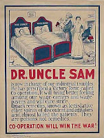
The first two images exhibit traditional stacked type, as seen on many early posters. Not too effective to show visual importance, especially in the 2nd poster. The first one features illustrations and shows the common icons, ex: the pointing hand. The 3rd image is not fresh from the 19th century, but a new look since my peers may be pulling from so many of the same online from the 19th. This is an early American propaganda poster. More illustrative, shows improvements with incorporation of image with text and subject matter, as opposed to previous popular poster styles.
The fourth image, a classic look and feel print from HatchShow, mixes bold sans serif with a line of serif. The fonts flow more peacefully than the style of images 1 and 2. This is a sort of reinvented, prettier, classic look.
The fifth image, highly informational, information stacked similar to an old sort of style. San serif is only style used, unlike the commonly used serif in the past.
The fifth image, a digital take on the extreme traditional stacking and wide font variety style.
Thursday, February 26, 2009
Timothy O'Sullivan
Proud to say, I have written a small paper on this fellow before. Here is an introduction to assist point of viewing and understanding for his work and where he was coming from.
He worked for M.Brady but eventually found himself fighting in the the war he used to take pictures of, the American Civil War. After his stint in the war, he was honorably discharged, he rejoined Matthew Brady.
Field where General Reynolds fell, 1863

Dead Horses of Bigelow's Battery, 1863

Harvest of Death, 1863
Did similar work as Brady, they both took pictures of the war. Struggles, battles, troups and such.
Upon some notice of fame, he joined Alexander Gardner’s (often famous for his photographs of Abraham Lincoln, one below) studio from which he first had his work published, around 30 pictures.


He worked for M.Brady but eventually found himself fighting in the the war he used to take pictures of, the American Civil War. After his stint in the war, he was honorably discharged, he rejoined Matthew Brady.

Field where General Reynolds fell, 1863

Dead Horses of Bigelow's Battery, 1863
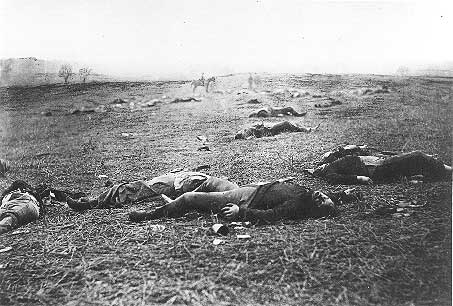
Harvest of Death, 1863
Did similar work as Brady, they both took pictures of the war. Struggles, battles, troups and such.
Upon some notice of fame, he joined Alexander Gardner’s (often famous for his photographs of Abraham Lincoln, one below) studio from which he first had his work published, around 30 pictures.

In the late 1860’s he became the official photographer for the United States Geological exploration crew. They started in Nevada and explored the southwest, the land features, the mines, the smelting houses, and so on.
Unfortunately, on a trip up the Colorado River, O'Sullivan and his colleagues found themselves in danger. One of the boats was taken under by the intense rapids, killing a few men and while this is terrible, it is also terrible that this was the boat that had most of the crews food supply and living materials aboard.
Black Canyon, 1871
Upon those adventures, he was part of a crew that surveyed the Panama Canal. The quality of photographs deminished a little, understandable due to rigorous conditions of living in the area for the crew.

Panama Canal, US Crew at work
Upon returning to the U.S. he took one more trip out to the West, completeing a long-awaited series of photographs of the far territories.
In the last of his life he was in Washington DC, where he was the photographer for the Treasury Department. After such a short, but adventurous life, he died on Staten Island of Tuberculosis around the age of 40.
In the last of his life he was in Washington DC, where he was the photographer for the Treasury Department. After such a short, but adventurous life, he died on Staten Island of Tuberculosis around the age of 40.
Piet Zwart


Google Piet Zwart's name and these are some of the images that will pop up. Images that are highly graphic, colorful and fresh. For it to only be nearly the 1930's, Piet's work is fantastically inspiring. One can see its links even to today's work. Places such as Hatch Show and Yeehaw seem to be influenced by this Dutch take on typography. It's fascinating.
I am choosing Zwart because I am amused by the way he loosely places letters and picks bold colors, yet keeps balance. Images today seem to take on a similar style. He also incorporates collaged images above and below lettering. He used photo collage and typography instead of illustrative advertising or design,which was a big thing at the time. He helped to bring a new style to the game.
I would like to make a series of posters in the style of Zwart. These will be created mostly by silk screening, however, some may be produced with Adobe Illustrator. Using Zwart as a muse for these creations I will also incorporate information and images about him and the design world at that time. Also, I would like to make a short film of the process of making these posters and the specific influences of his that show up in each piece. I will also bring up how he came about making such designs, via my process which will be similar to what his was. The video will be around 2 or 3 minutes, editing done in Adobe Priemere.
My presentation will be a short introduction, a viewing of the video, and then a showing of my posters and a discussion about them.
Monday, February 16, 2009
Jar Goats Three Panels

Housed today in the Metropolitan Museum of Art, NY. This is a persian peice, showing one of the first heavily repeated icon. The mountain goat or ibex. Common to Northern and Central Iran.
Each panel (3) was seperated very geometrically. The structure of the jar itself shows much improvement of craftsmanship over time. Things become more asthetically pleasing rather than simply useful.
Each panel (3) was seperated very geometrically. The structure of the jar itself shows much improvement of craftsmanship over time. Things become more asthetically pleasing rather than simply useful.
Subscribe to:
Posts (Atom)